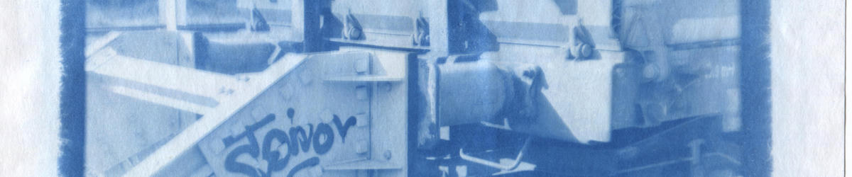
The great cyanotype comparison
Filed under: Cyanotype, Photography
This post was originally posted to my tumblr in 2017, this version has been slightly revised.
While trying to improve the quality of the cyanotype prints made on my home built enlarger I came across a whole number of different techniques for increasing the sensitivity and quality of cyanotype prints, but I’ve never done a comprehensive comparison.
So a few days ago I sat down and tested 6 different cyanotype formulas and techniques. All prints were made on A5 size printer paper and were exposed for 15 minutes. I chose a negative that has a wide dynamic range with deep shadows and some very bright highlights. All images were first washed in tap water and then in a weak solution of acetic acid and hydrogen peroxide.
I also tested toning with three of the techniques using a mix of tannic acid and black tea.
Most of the different formulations used here were taken from Mike Ware’s excellent Cyanomicon which can be found here: http://www.mikeware.co.uk/mikeware/downloads.html
Lets begin.
Classic Cyanotype

This print used the classic mixture of a 25% solution of ammonium ferric citrate and a 10% solution of potassium ferricyanide in equal parts.
As it’s clearly visible it’s not nearly sensitive enough for use with an enlarger. After 15 minutes of exposure only the clear parts of negative show some very slight darkening.
Mike Ware’s New Cyanotype

Now, before you tell me that it’s not supposed to look like this, I know. I’m pretty sure I fucked this up.
This technique mainly sets itself apart from the classic cyanotype by using an iron oxalate salt instead of an iron citrate salt as light sensitive component. The preparation is a little more involved compared to the other formulas but overall not too hard. The exact recipe is outlined on Mike Ware’s website.
As you can see the sensitivity is definitely improved compared to the classic cyanotype. The image is clearly visible, albeit underexposed. My main problem was that the solution left a very persistent yellow stain on the paper that I was not able to remove even after vigorous washing. The stain does not look quite as bad in reality as opposed to the scan, but it’s still pretty unsightly.
I’m not quite sure what’s to blame here. Maybe the ammonium ferric oxalate I got was of low quality, maybe it’s a reaction with the paper. I hope I can repeat these experiments soon and find out what’s going on.
Blue Layer Cyanotype

This print uses the “Blue Layer“ cyanotype outlined in Make Ware’s Cyanomicon. It’s a formula that was mostly used for industrial blue print paper. The main difference compared to the classic formula is that it uses potassium ferrocyanide instead of potassium ferricyanide. That’s it.
As you can see it’s a lot more sensitive than both the classic and the new cyanotype. The contrast is noticeably lower than the one of the classic formula, but the dynamic range is greatly extended.
One drawback of this technique is that a small amount of prussian blue is already formed during the mixing of the solutions, leading to a blue staining of the paper surface during coating. As opposed to the dye that is generated during exposure this stain sits at the top of the paper and washes off easily. It is therefore important to use a relatively smooth paper.
What should also be noted is that this is not strictly a print out process like the classic cyanotype. During exposure only a faint positive image is created, the actual negative image does not become visible until the print is washed and oxidized, either in air or a weak solution of hydrogen peroxide.
Blue Layer Cyanotype 2+1

This is the same process as above, but with twice the amount of the ammonium ferric citrate sensitizer used.
This has become my go-to solution for pretty much all my prints as it has great sensitivity and dynamic range. The contrast tends to be a little on the low side but this can be adjusted easily by reducing the amount of light and exposing for longer.
Terry King’s Cyanotype Rex

This apparently controversial technique works by only exposing the ammonium ferric citrate by itself and “developing” it in a bath of potassium ferricyanide solution. Instead of developing in a separate bath, which is very wasteful, I chose to simply brush the potassium ferricyanide onto the paper after exposure.
As you can see the sensitivity and tonal range is greatly improved compared to the classic process, but it’s still nowhere close to the sensitivity of the blue layer formula. Also the brushing of the potassium ferricyanide can leave visible brush marks, and the only way to avoid that is to use a developer bath which quickly gets contaminated with prussian blue and needs to be changed regularly, which is pretty wasteful and expensive.
Blue Layer Cyanotype Rex

As an experiment I also tried to use the blue layer potassium ferrocyanide with the Cyanotype Rex process.
Generally the results seem very similar to the 2+1 blue layer print. The mid-tones seem a little darker in some places, and slightly more detailed.
Overall I think this is the best quality print, with the 2+1 blue layer print as a very close second. I’m not sure if the extra effort in making this is really worth it though.
Now, let’s look at some toned images.
Toned New Cyanotype

Yeahhh, I’m pretty sure I fucked this up. What was a light yellow stain in the un-toned image has just turned into a thick brown mess in the toned image, indicating that the stain was rich in iron and probably comes from the iron oxalate.
Again, I’m sure this is in no way a fault with Make Ware’s procedure, it’s just me messing something up. If somebody has an idea what this could be I’d love to hear it.
Toned Blue Layer Cyanotype

This blue layer cyanotype print was toned using a mix of tannic acid and black tea for around 8 minutes without any prior bleaching.
Overall I’m really happy with the tonality, even though there is some staining of the paper, giving it a distinct “vintage” look. Again, my scanner really accentuated the staining, and it’s not nearly as strong in real life.
Toned 2+1 Blue Layer Cyanotype

Same thing as before, but using twice the amount of ammonium ferric citrate in the print.
I’m really happy with this print. Having a little more density in the print leads to a very nice duotone effect during toning since the highlights are toned much faster that the shadows where there is more prussian blue present. Again, the staining of the paper looks much worse on the scan than it is in reality.
I’ve made a number of prints using this combination of techniques already, and I love the results.
Results
I love the blue layer cyanotype process, and I don’t know why it isn’t used or talked about more. It gives far superior results to much more complicated and costly solutions.
Now, I understand that the look is different from the very high contrast look of the classical cyanotype, but honestly, I don’t mind that at all. Both techniques have their uses and pros and cons, but I think the blue layer process is severely overlooked in modern cyanotyping.
P.s.: I know some of the prints are pretty out of focus. The prints themselves were done pretty hastily in just a few hours and I didn’t pay enough attention to that it seems. I was more focused on getting the chemicals right. From experience I can say the I was not able to notice any significant changes in sharpness between any of the methods. But maybe that’s a topic for the next comparison.